1
2
3
4
5
6
7
8
9
10
11
12
13
14
15
16
17
18
19
20
21
22
23
24
25
26
27
28
29
30
31
32
33
34
35
36
37
38
39
40
41
42
43
44
45
46
47
48
49
50
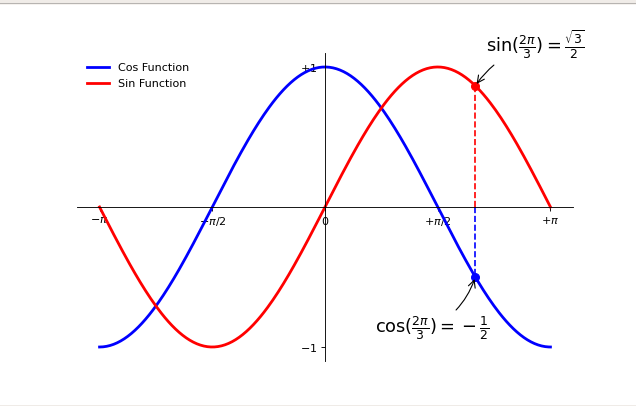
|
import numpy as np
import matplotlib.pyplot as plt
plt.figure(figsize=(8, 5), dpi=80)
ax = plt.subplot(111)
ax.spines['right'].set_color('none')
ax.spines['top'].set_color('none')
ax.xaxis.set_ticks_position('bottom')
ax.spines['bottom'].set_position(('data', 0))
ax.yaxis.set_ticks_position('left')
ax.spines['left'].set_position(('data', 0))
X = np.linspace(-np.pi, np.pi, 256, endpoint=True)
C, S = np.cos(X), np.sin(X)
plt.plot(X, C, color="blue", linewidth=2.5,
linestyle="-", label="Cos Function")
plt.plot(X, S, color="red", linewidth=2.5, linestyle="-", label="Sin Function")
plt.xlim(X.min() * 1.1, X.max() * 1.1)
plt.xticks([-np.pi, -np.pi / 2, 0, np.pi / 2, np.pi],
[r'$-\pi$', r'$-\pi/2$', r'$0$', r'$+\pi/2$', r'$+\pi$'])
plt.ylim(C.min() * 1.1, C.max() * 1.1)
plt.yticks([-1, +1],
[r'$-1$', r'$+1$'])
t = 2 * np.pi / 3
plt.plot([t, t], [0, np.cos(t)],
color='blue', linewidth=1.5, linestyle="--")
plt.scatter([t, ], [np.cos(t), ], 50, color='blue')
plt.annotate(r'$\sin(\frac{2\pi}{3})=\frac{\sqrt{3}}{2}$',
xy=(t, np.sin(t)), xycoords='data',
xytext=(+10, +30), textcoords='offset points', fontsize=16,
arrowprops=dict(arrowstyle="->", connectionstyle="arc3,rad=.2"))
plt.plot([t, t], [0, np.sin(t)],
color='red', linewidth=1.5, linestyle="--")
plt.scatter([t, ], [np.sin(t), ], 50, color='red')
plt.annotate(r'$\cos(\frac{2\pi}{3})=-\frac{1}{2}$',
xy=(t, np.cos(t)), xycoords='data',
xytext=(-90, -50), textcoords='offset points', fontsize=16,
arrowprops=dict(arrowstyle="->", connectionstyle="arc3,rad=.2"))
plt.legend(loc='upper left', frameon=False)
plt.show()
|